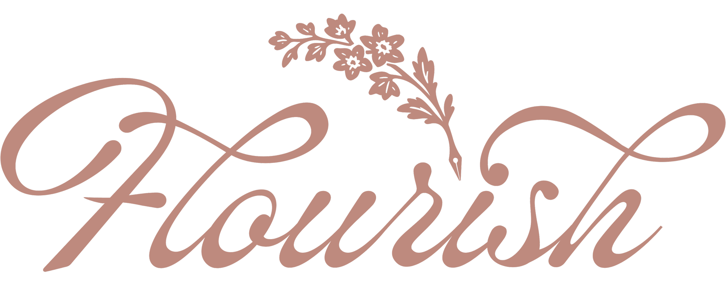
Flourish
Flourish is a french patisserie that was a design collaboration between Lexi Brookey of Brookey Design Co. and myself. This is the first ever chef owned patisserie in Abilene. The client wanted the logo to show craftsmanship and refinement, include their tagline “Beauty in a Bite”, and have some sort of floral illustration.
This Project includes:
Branding
Typography
Textile Design
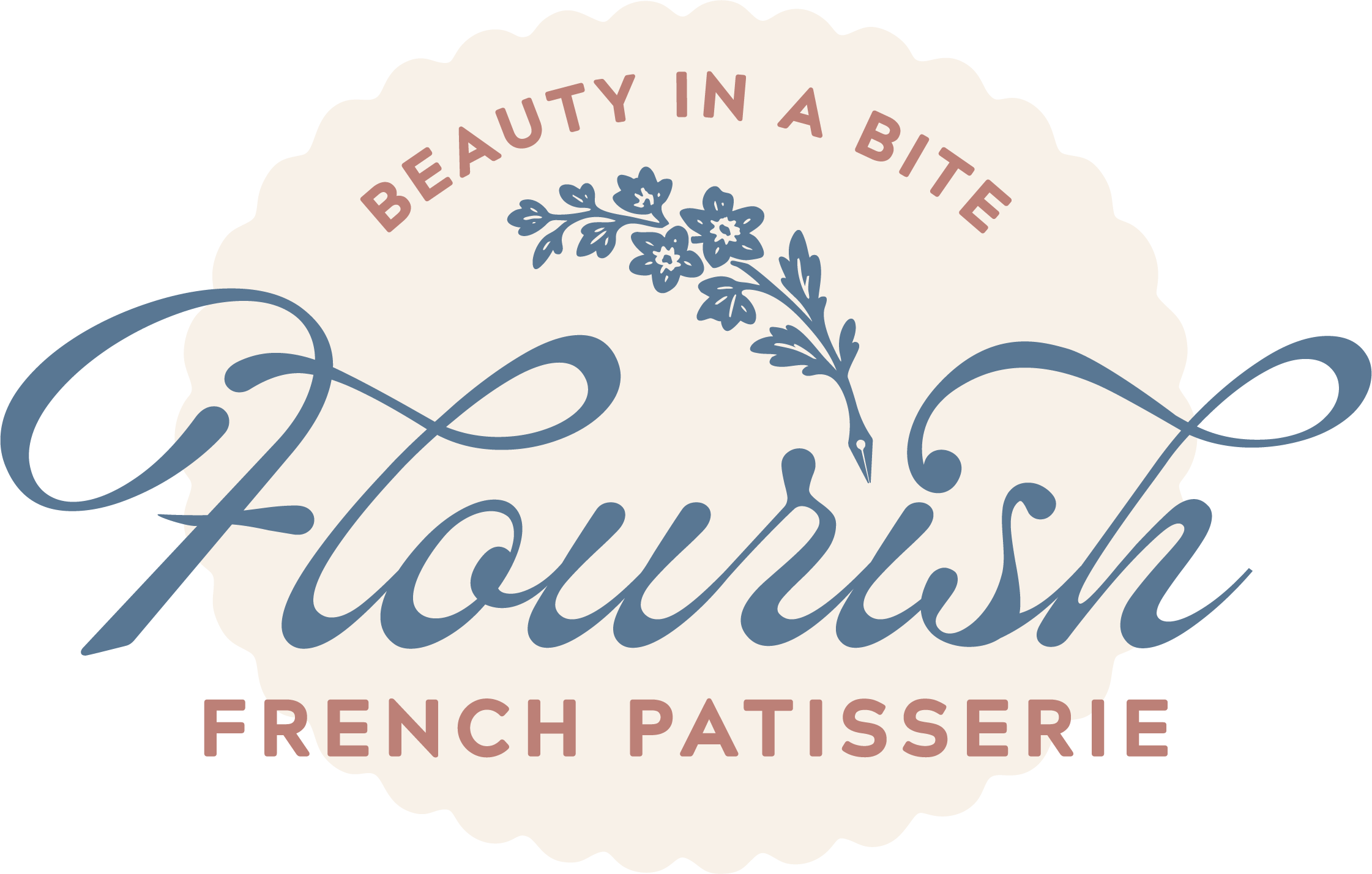
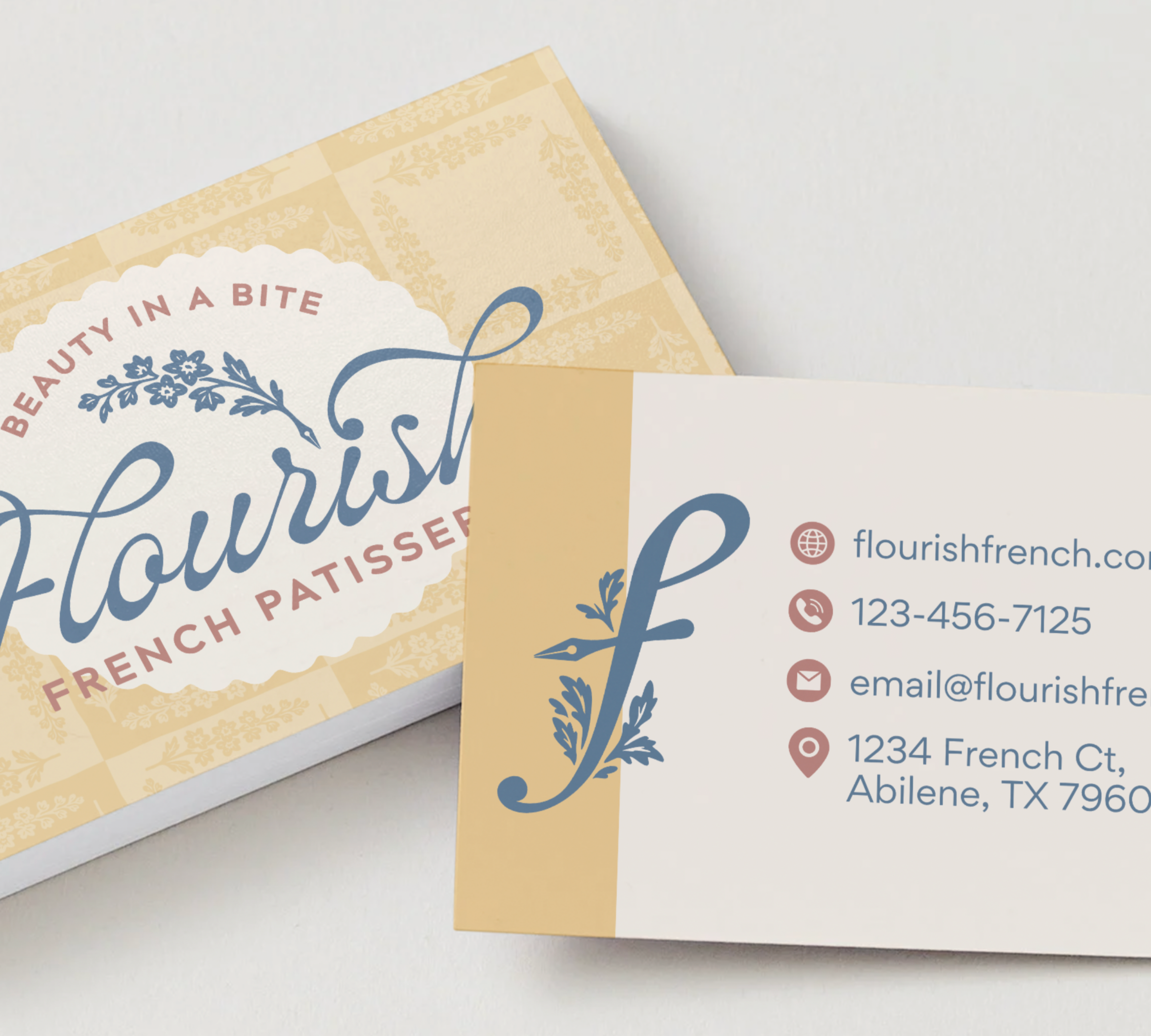
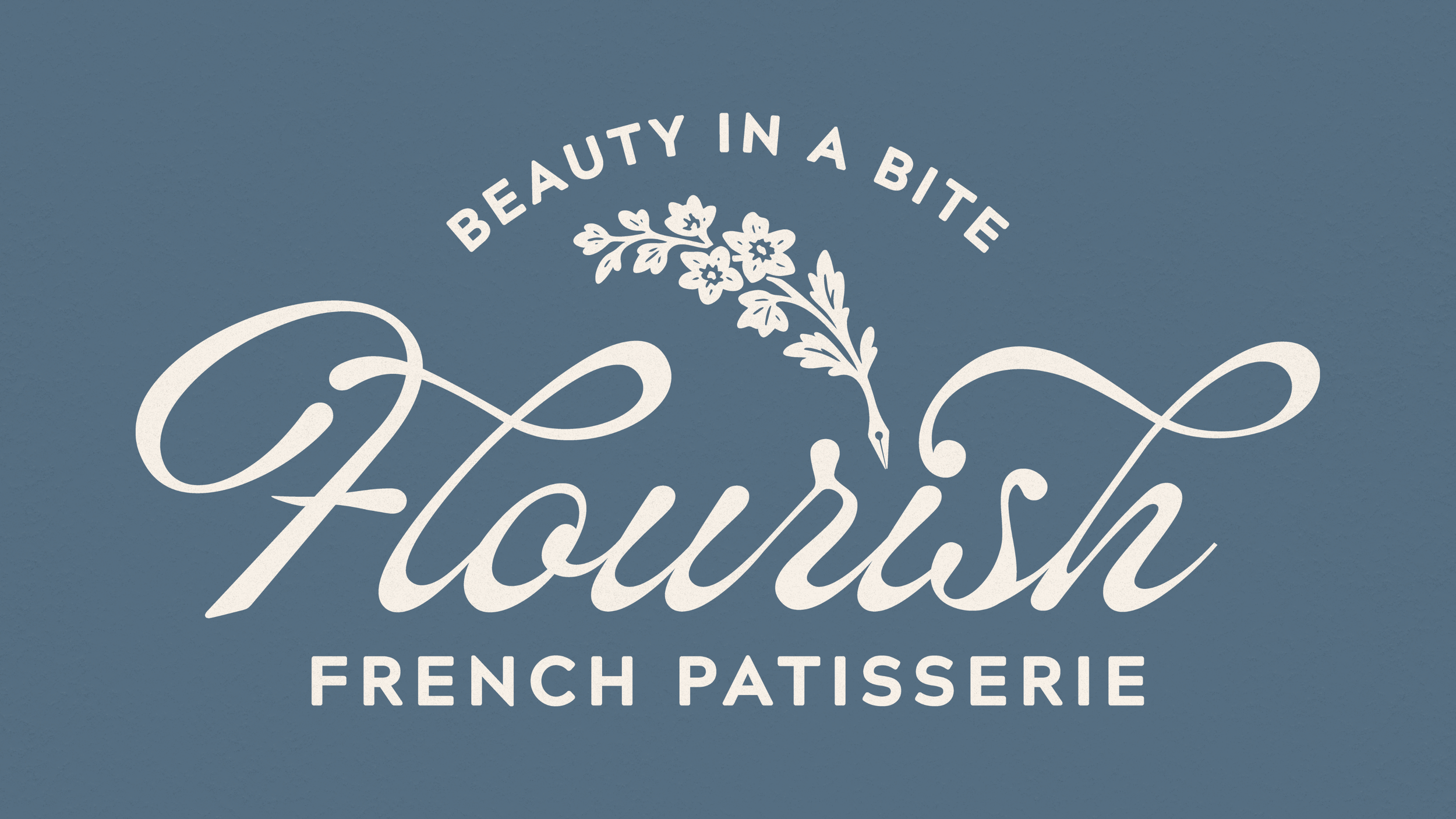
Primary Logo

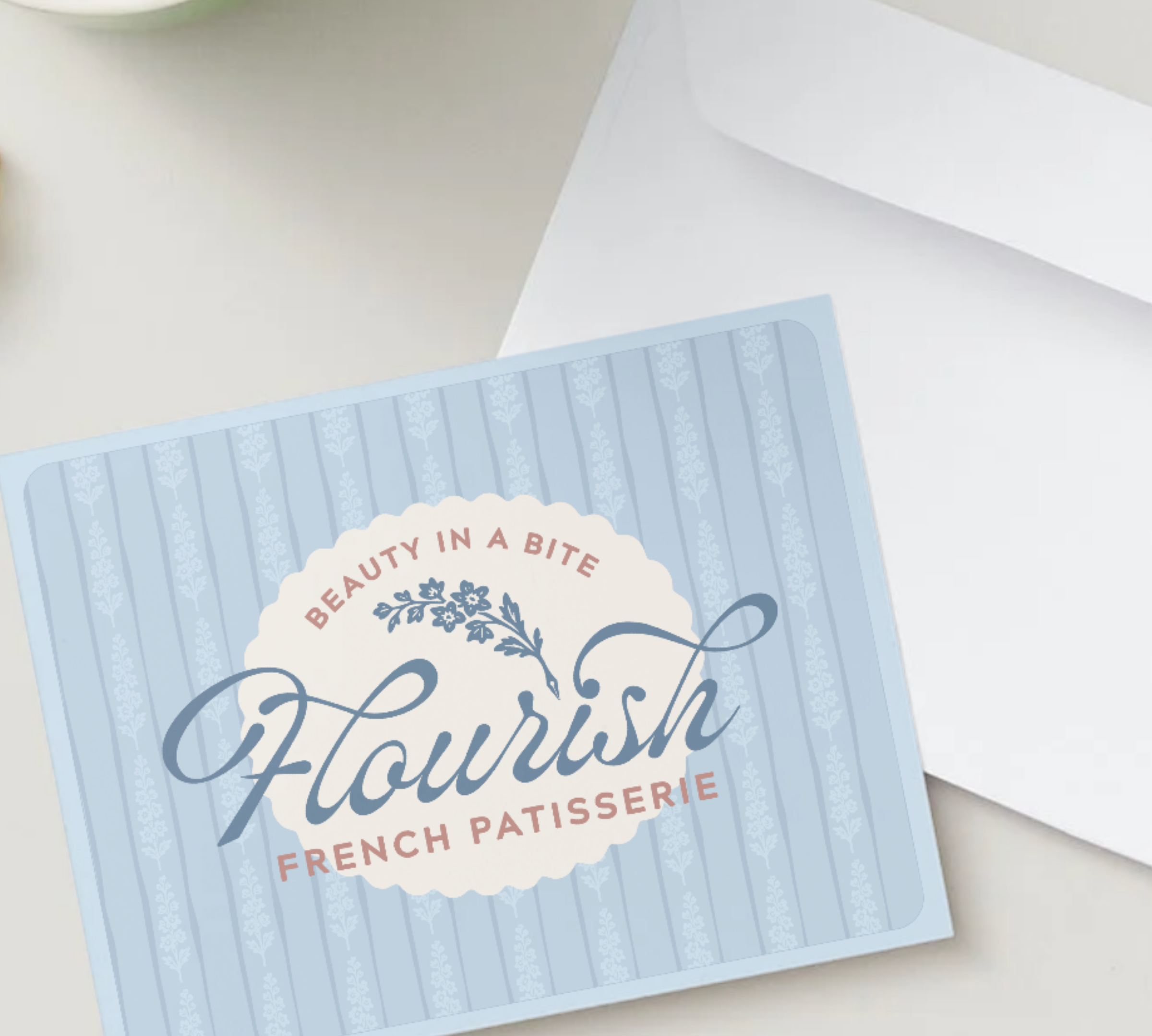
Badge

Faivicon
Breakdown
Type
For the main type, we wanted it to give the feeling of whipped cream being pulled, so we used the typeface “Lavonia Classy” and modified certain letters to give more of a dolloped feel.
Illustration/ Brandmark
The flower that is part of the brandmark is a Delphinium. This flower is significant to the client because it is both owners birth flower and it is also french, like their patisserie . The quill tip was added because this business will one day also have a book store, and a flourish would be made with a pen after all.
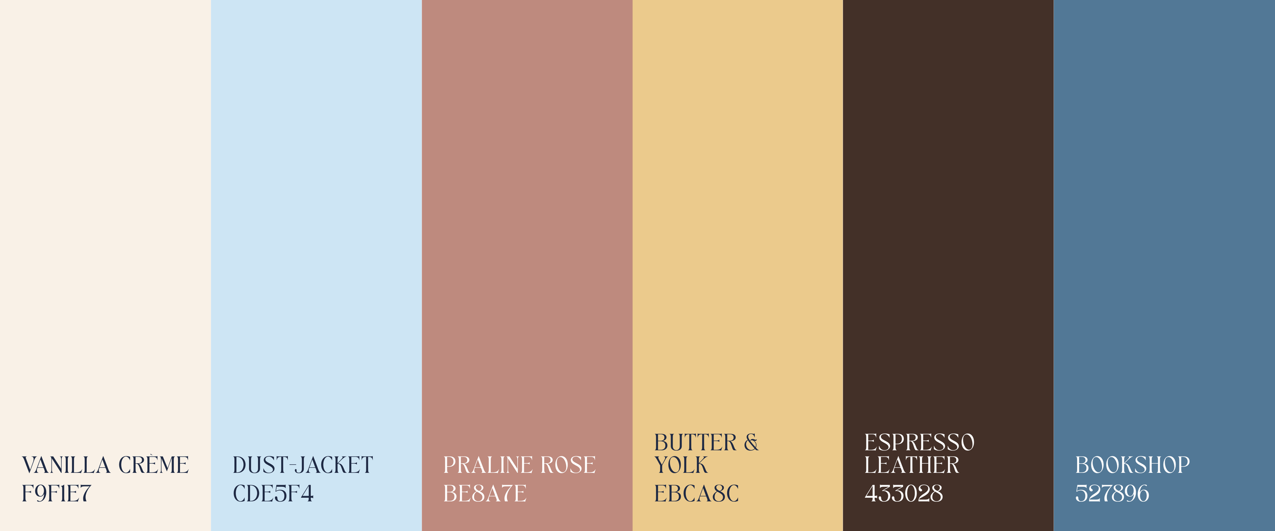
Color Palette
Illustrations
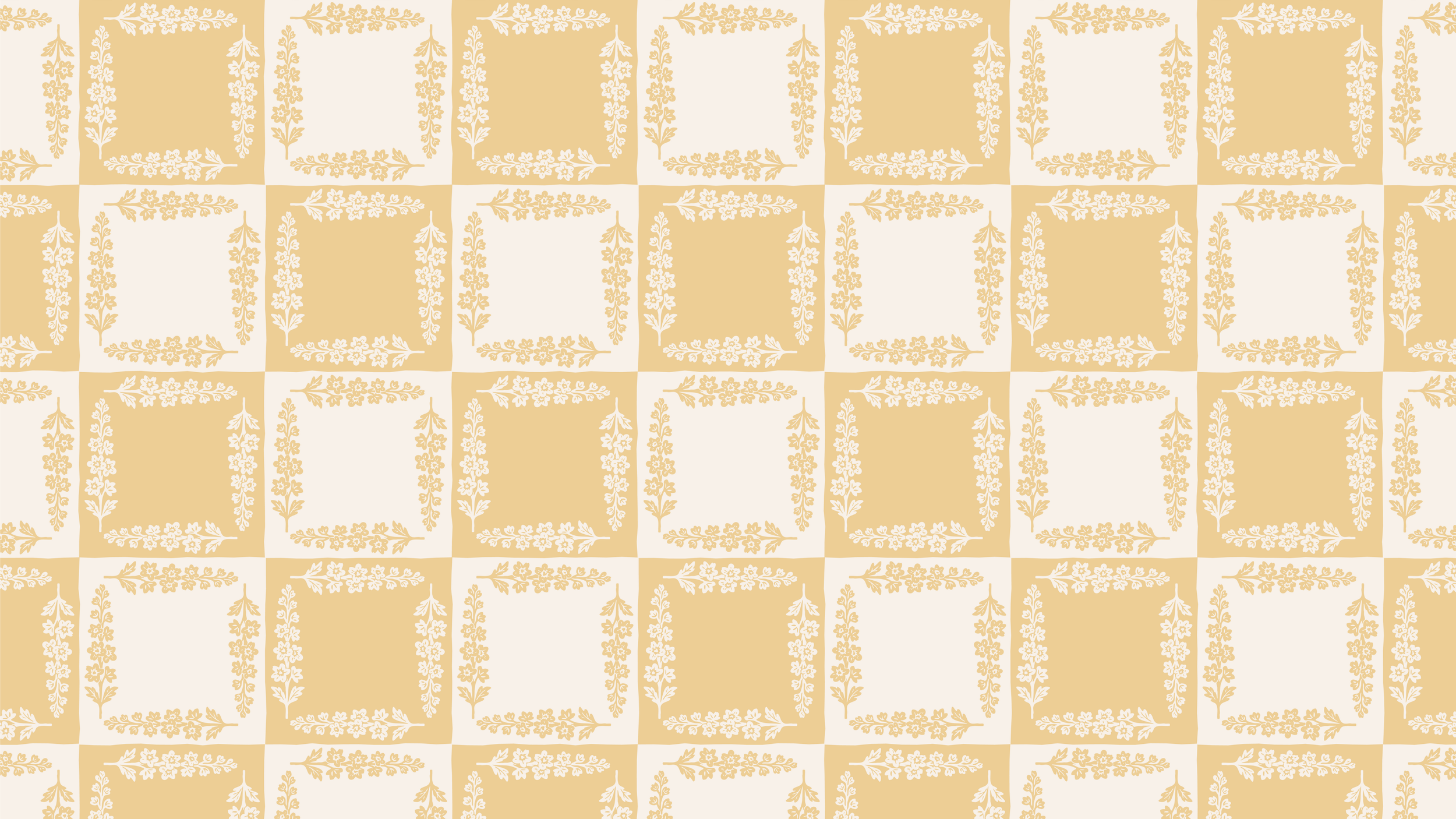
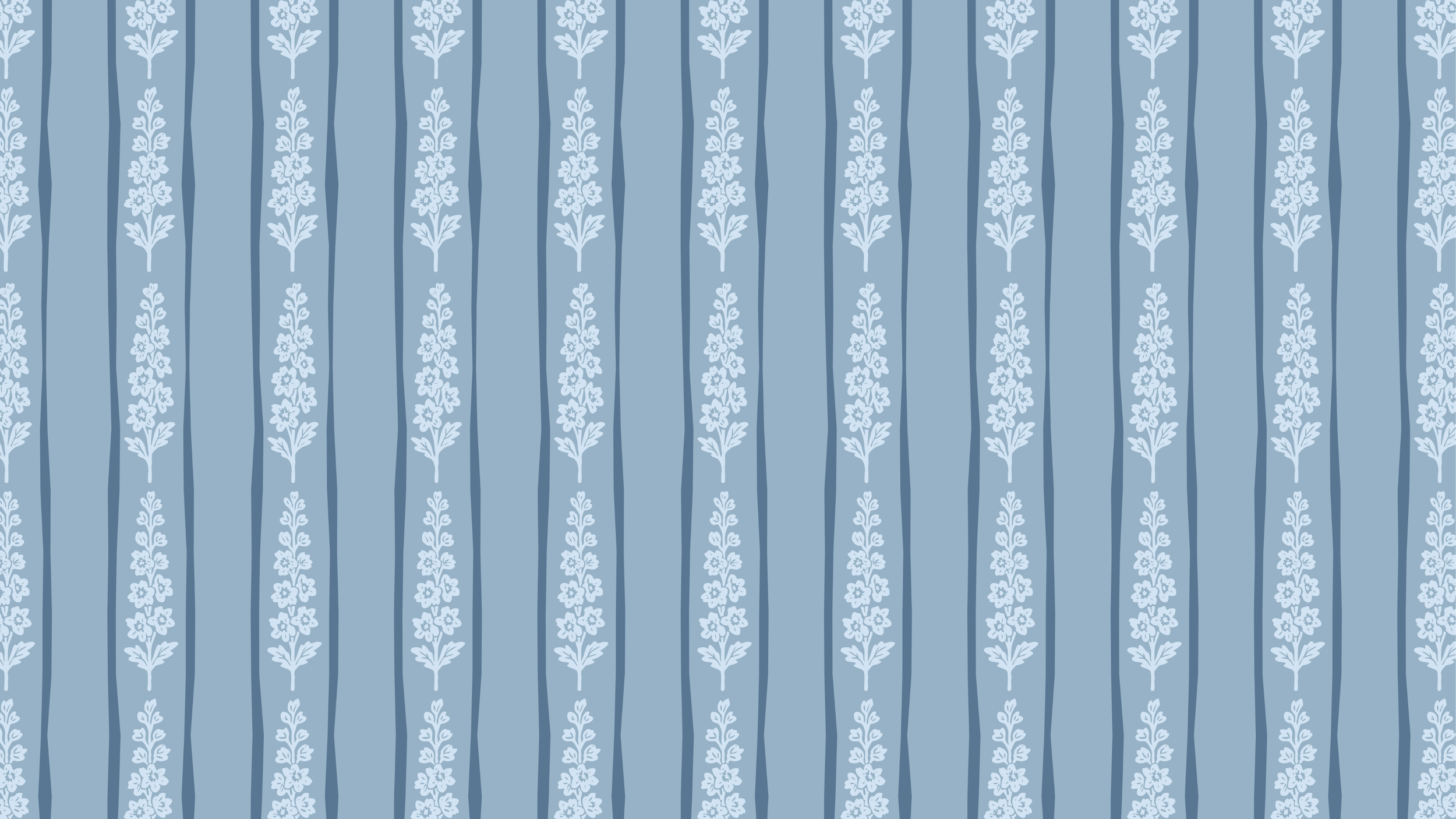
For illustrations, we wanted to keep a simple and clean illustration style that nodded to some historical styles similar to wallpaper.


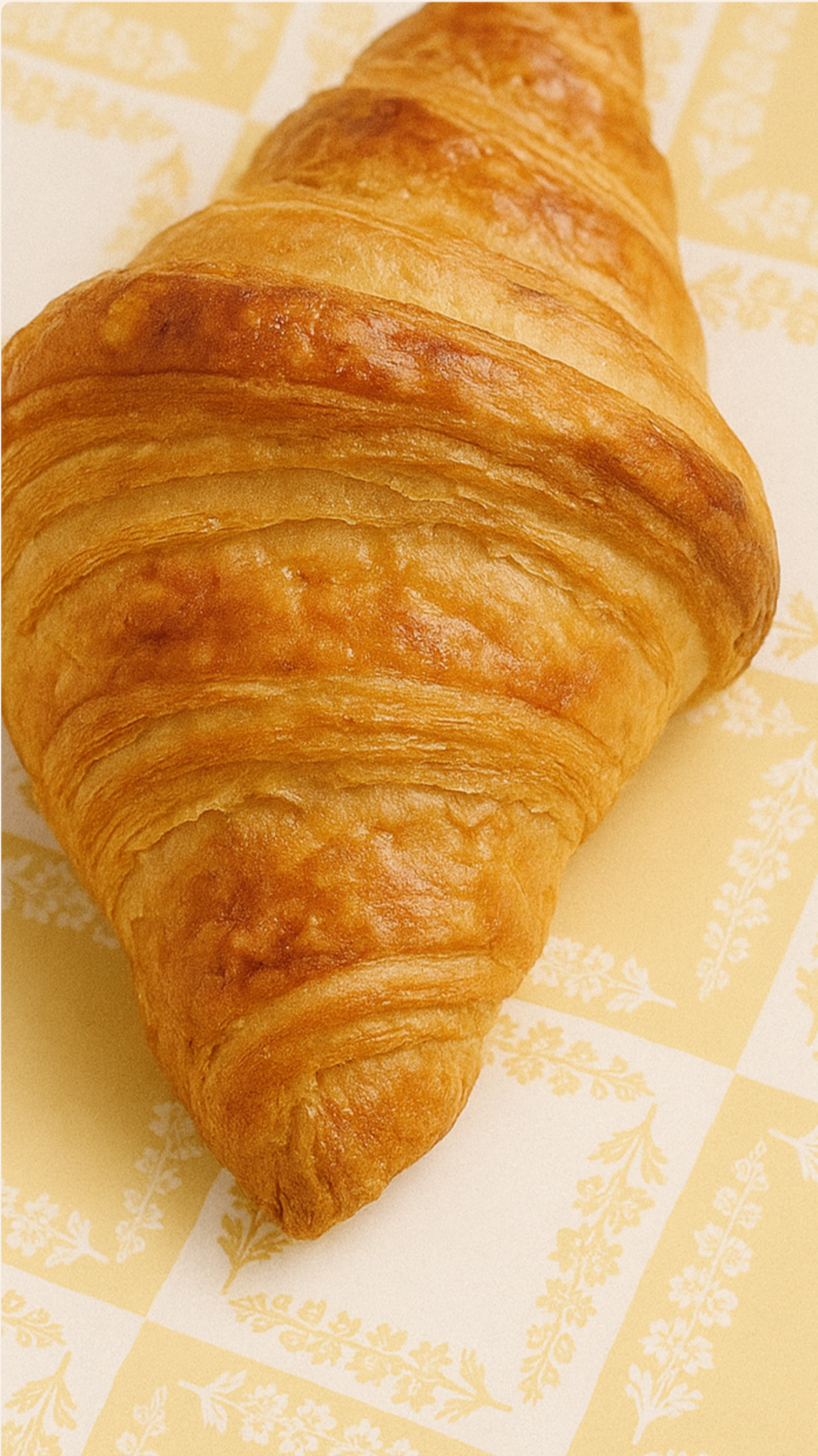
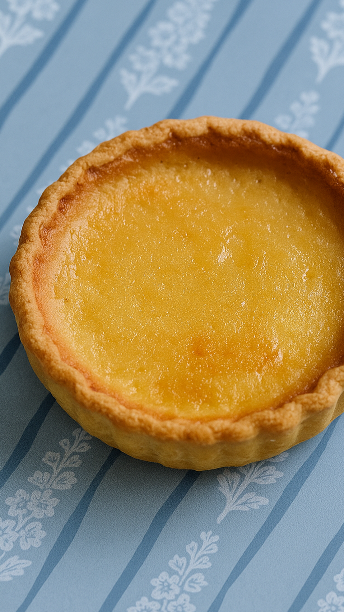
Textile
This Client wanted a pattern designed that they could use for curtains, wrapping paper, and any other packaging that might be enhanced by a pattern. They were interested in gingham and ticking stripes, so we used our illustration to create the two patterns below.